
The Harpsichord blocks, that is. Something was nagging at me about the colours, so I decided to sort the blocks into colour families and see where I was at. And I was in for a bit of a shock.
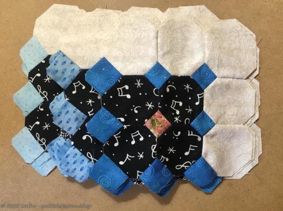
The blue Harpsichord blocks consist of dark blue, medium blue and light blue blocks.
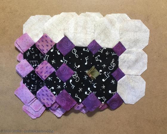
Which is the same for the purple Harpsichord blocks.

And the olive green ones.

And the sea green ones – I really don’t know what else to call this colour but sea green.
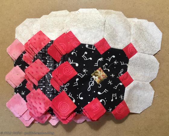
And, of course, my favourites – the pink ones – have some of each value.
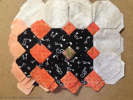
But then I came to the orange ones. There were only medium and light ones!

I knew that the fabrics I used for the little .75″ squares all came from the same line and that I had three of each colour. So off I went to search for the darker orange. I’m so glad I hadn’t used it in something else. I’ve already printed enough little squares on this to make 8 dark orange Harpsichord blocks.
It’s good I checked this now before I had gone much further making the blocks. I still have more than enough blocks to piece. Needing to make a number of dark orange ones doesn’t mean I have to take other completed Harpsichord blocks apart.
Once I had started that exercise of sorting the blocks, I decided to see how balanced the number of blocks of each colour were and surprise – not the least bit surprisingly, I found I have more pink Harpsichord blocks than any other colour, closely followed by blue ones and light and medium purple and even the medium and light orange ones than either of the two green sets. I don’t think I’m going to try to balance that too much as my overall impression of the illustrations on the gorgeous harpsichords we saw was more of colours of flowers with a bit of green rather than balanced. Although now that I look at the pictures of them all in this post, even the medium and light values of the two greens seem like little pops of colour but the two darker greens do seem a bit drab in comparison to all the others.
I was also wondering about how much of the darkest of each colour versus the medium and light ones I wanted to use. Initially I thought that they all might be too dark, but they’re still going to be lovely little bursts of colour. This is why I said on Monday that I thought that the three green Harpsichord blocks in that post were the last of the green blocks I’d be making. I’m still inclined to stick with that plan and add more blues and purples and oranges and pinks from here on out although I may add a few more of the medium and light green ones.
I’m glad I checked the blocks when I did and that I found that darker orange fabric. Now I can finish making these blocks and am pretty sure that I’ll be quite content with the colour/value distribution.
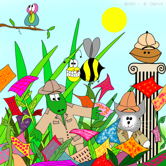
“Searching the Fabric Jungle”
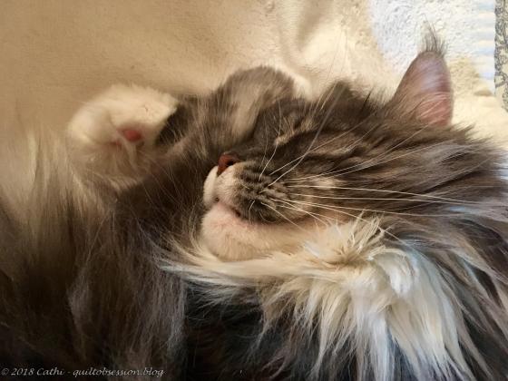
I couldn’t resist taking this photo of Baxter looking oh, so sweet as he slept with his two front paws curled up by his face like that.


That fabric jungle search looks like my room when I’m having a hard time finding a certain fabric.😀 I so agree that that orange fabric will make your other lighter oranges pop.
LikeLiked by 1 person
I’m so glad I had an idea where that darker orange fabric was. Otherwise it would have looked like that ‘toon if I’d had to hunt for it!!
Cathi
>
LikeLiked by 1 person
Do you sleep at night or dream in color?? 🙂
LikeLiked by 1 person
Funnily enough, I don’t often dream about quilts. It’s when I’m washing my hair that I almost always get ideas about quilts. Someone needs to make a waterproof notebook and a pen that would work in the shower so I could write my ideas down!!
Cathi
>
LikeLike
This is going to be stunning!
LikeLiked by 1 person
Thank you – the original Lucy Boston Keyboard Patchwork is very stunning. I’m starting to think about what I’ll do for the borders of my Harpischord Quilt.
Cathi
>
LikeLike
Decisions, decisions. How many are enough, and how many are toooooo many?!?!? Good to see Baxter without a grumpy look. Sweet dreams, furball.
LikeLiked by 1 person
There’s no way I’ll ever say no to more pink but I think I do have to balance this a wee bit more – maybe. We’ll see.
Cathi
>
LikeLike
How nice to see all these blocks. Love the orange fabric!
LikeLiked by 1 person
The original Lucy Boston Keyboard Patchwork is stunning. I hope that my version will really reflect the overall feeling I got from the gorgeous harpsichords we saw – the illustrations on them were just so striking that I still remember them vividly, years later.
Cathi
>
LikeLike