Another one finished and now only 19 to go. I seem to be leaning to working on this and Memories of Smudge at the same time, although once Friday comes it will be the Memories of Smudge blocks only until they’re finished.
Figuring out the setting of the Memories of Smudge blocks may take some time as I want to try to ensure that the same fabrics don’t meet. That could be rather tricky as there aren’t a huge variety of fabrics used in the blocks. I’m going to tack a flannel sheet up on the wall and take my time sorting out the placement. While that’s going on, I will be back to working on Stormy Seas.
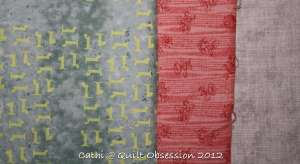
In addition to the groupings of fabrics I showed yesterday I’m trying to figure out what to use with this fabric. I’ve had it for ages and it really intrigues me but finding just the right other fabric(s) to use with it has become a challenge. We photographed it on top of a piece of grey fabric in hopes of getting a true read on its colour.
With a purple batik? Maybe.
With a pink? Very slight maybe.
With a yellow? No, not with a kitty paw too.
This is it with the yellow which appears more orange than it is. Anyway, I don’t think this one works.
Mr. Q.O. suggested using a red with it. This does not appeal to me at all.
I’ve put it beside a white and can almost see it as a very low contrast two-colour quilt with a white. But I’m absolutely stymied when it comes to using it with anything but that white. Any suggestions on what to pair with it are more than welcome. Or perhaps this is one of those fabrics that needs to be a quilt backing.
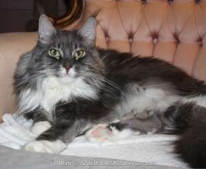
Baxter was watching the enormous robins again.
After another busy day of watching the birds and squirrels, he was resting in “his” chair.


Why not try pairing it with whatever color that print is? It looks like a limeish green on my monitor, but it may be off. But then again, I think green is a neutral and goes with everything 😉
LikeLike
Funny…. I prefer either of the last two colors, which you don’t really care for…. The yellow would be my first choice though. The reasoning is that these colors are much more vibrant than the first ones. That in my mind is what makes these work.
LikeLike
It’s obviously hard work keeping an eye on the local wildlife, no wonder Baxter has to rest! Your fabric looks like the colour of eucalypt trees to me – a greyish-green – it suits a softer lemon yellow quite well.
LikeLike
Looks greenish to me, but hard to tell, if so a soft yellow might work??
Baxter loves to patrol the outside even with those big-eyed robins watching him.
LikeLike
I was also thinking of a green, but a darker one, perhaps even an olive. And keep the gray with it as well. It would be low contrast but very elegant looking, I think. Which pattern, though?
LikeLike
How about a black fabric? Would be interesting…. Cute Baxter.
LikeLike
Hi Cathi !! I just had to comment…..I always feel like I have to give my opinion LOL. I noticed that you didn’t have any greens or even blues as an option and greys also popped into my head. I also agree that a softer yellow as an accent piece would be lovely. Of course it all depends on the pattern you end up choosing.
Crispy (who reads blogs but doesn’t have time to leave comments or even post on her own blog)
PS – Tell Mr. QO that I absolutely adore is Baxter Cartoons and look forward to seeing them each day :0)
PSS – I didn’t give an opinion on which project you should work on as I know you have trouble sticking with just one….especially if Linda comes up with a new Inklingo design ROFLMAO…..love & miss ya girlfriend
LikeLike