
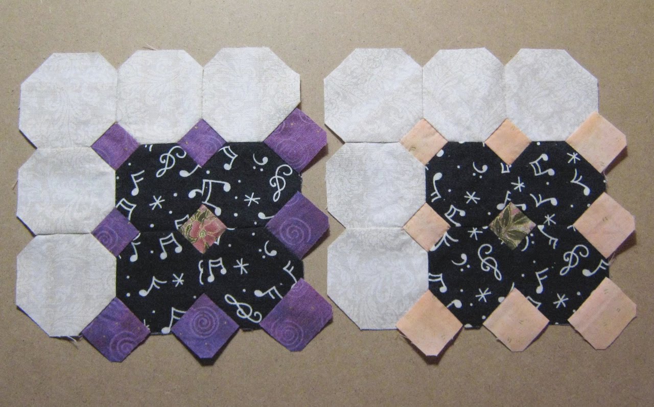
The block with the purple squares is definitely going in the quilt. But I’m wondering about the block with the pale peach ones. It may be too washed out — yet, as I recall the decorative elements of those harpsichords, while they had some vibrant colours, they also had some more faded, pale ones. I’d love to hear some opinions on this.
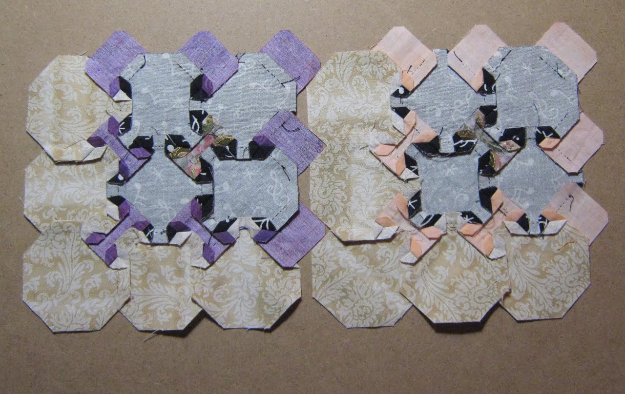
 The backs of the two blocks:
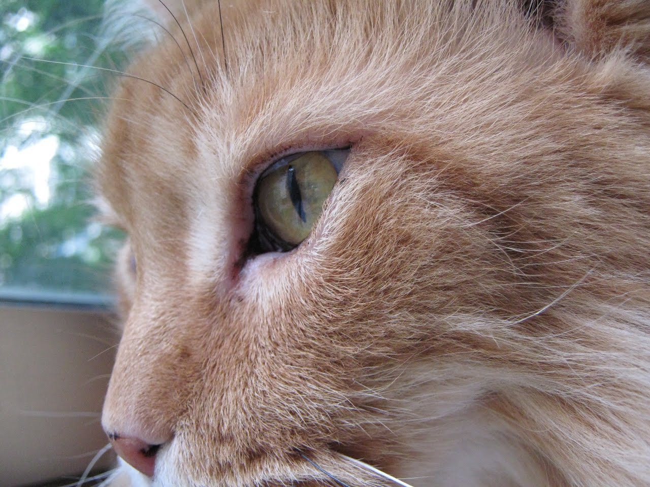
A very close-up view of Lester’s eye/profile. I cannot get over the detail this little camera captures.
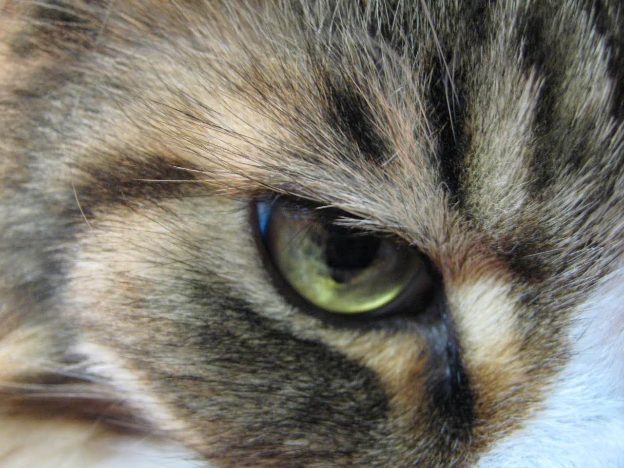
And, to make it a pair, a close-up of one of Smudge’s eyes.


Your detail to cat's eyes is extraordinary. Wonderful pics.Incidentally, love the block, too!
LikeLike
Great closeups of the guys.I think the addition of this color would provide a resting place for the eye as it travelled through the quilt, Cathi. In the art world, colors with less value and intensity should be placed at the outer limits of the design or furthest away from the centre of interest.
LikeLike
I say that you wait until all the blocks are done, lay it out, then decide if you like it in the layout. They have just beautiful eyes.
LikeLike
I vote to use the pale…as long as you are going to add some other pale ones.LOL you guys are sure having fun with the close ups. The cats are probably trying to figure out why you keep shoving the camera so close to their faces and feet :0)Crispy
LikeLike
It isn't the individual colors but instead the combination that makes a quilt come alive. It looks pretty pale now but it will probably be good in the quilt.
LikeLike
Hi Cathi,Love them both!The purple one, I will call "Blues", and the peach one, I will call "Nursery Rhymes". 🙂
LikeLike
Here I am….a little late today but had to get my kitty fix. Today's the eyes….I want to say Lester's today…yeah, Lester is my guy today!
LikeLike
I am really liking these blocks. I say keep the peach one in to give some contrast to the quilt. Beautiful photos of the kitties!
LikeLike
The blocks are lovely, especially the purple one.The cate-eye pictures are great!!
LikeLike