
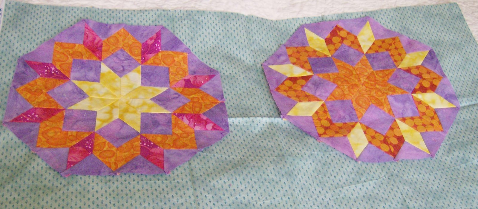
The gold fabric I showed yesterday to set these blocks just wasn’t quite right. What I’m looking for is sizzle, sort of a visual heatwave after the long winter we have had.
So I went stash shopping and auditioned a few. First I tried this blue.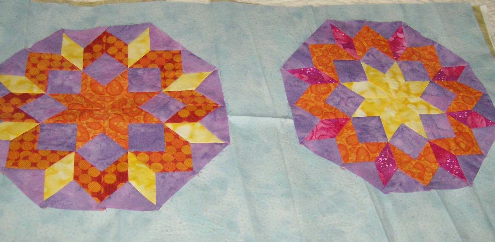
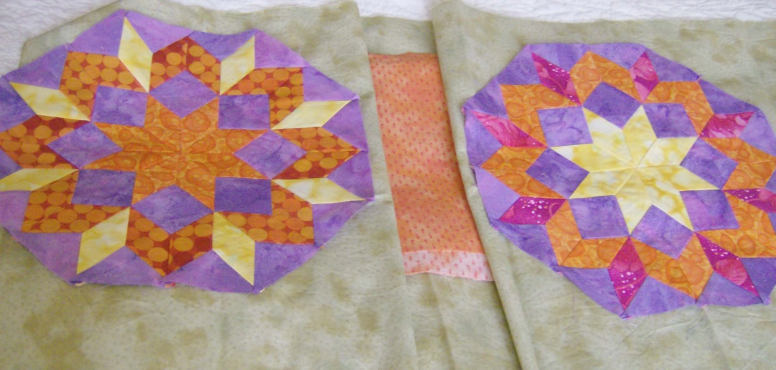
Then this. I had to use the flash for this picture which has distorted the colours a bit. If I decide on this I’m thinking the green right against the blocks with a thin strip of the orange on the outside.
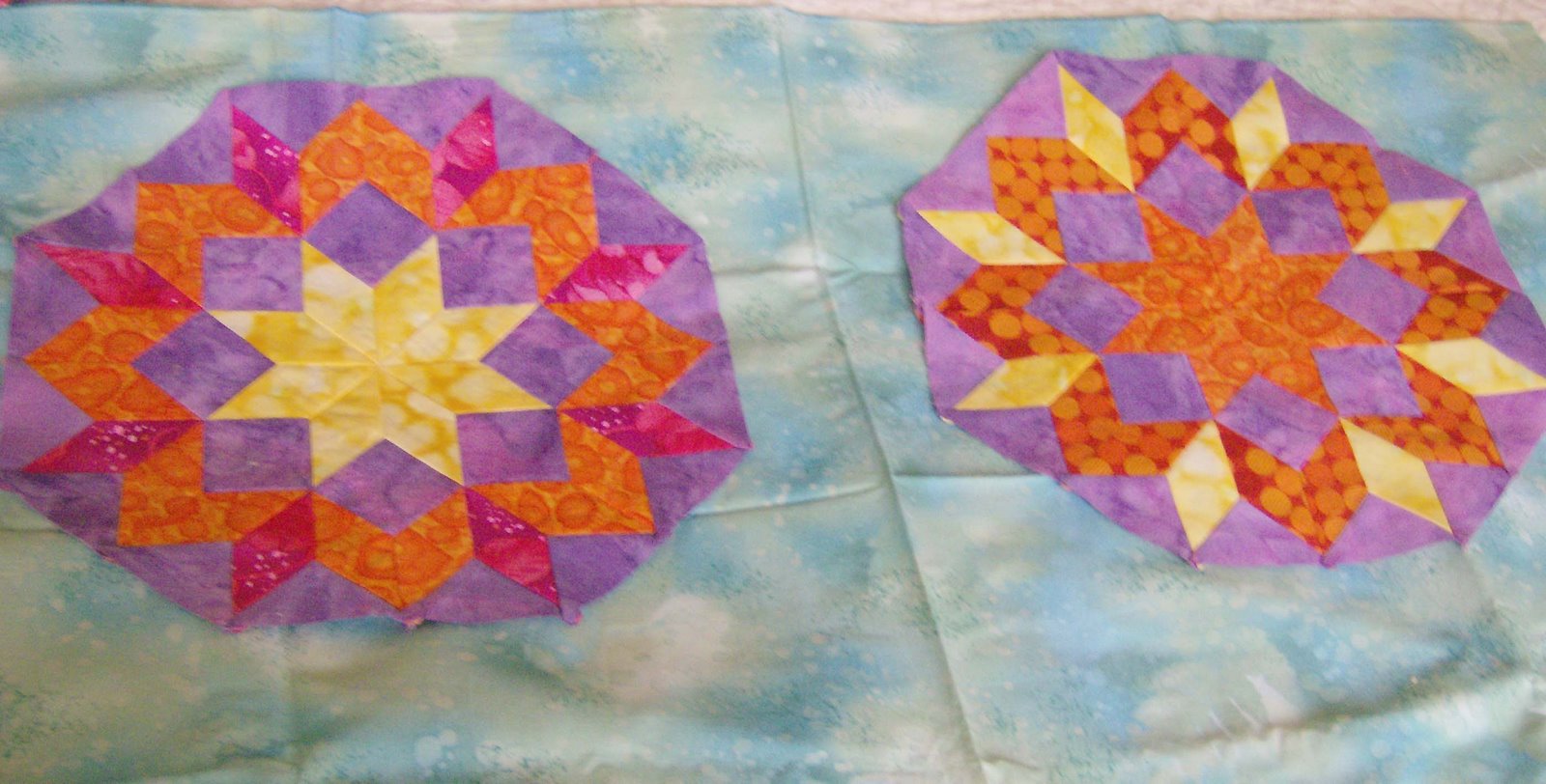
 This one? I don’t think so. The pink seems to wash out the purple but if the purple really is my “neutral”, then maybe I can get away with this. It’s the pink, of course, to which I almost always gravitate.

I like this effect too — sort of tropical punch by the water.
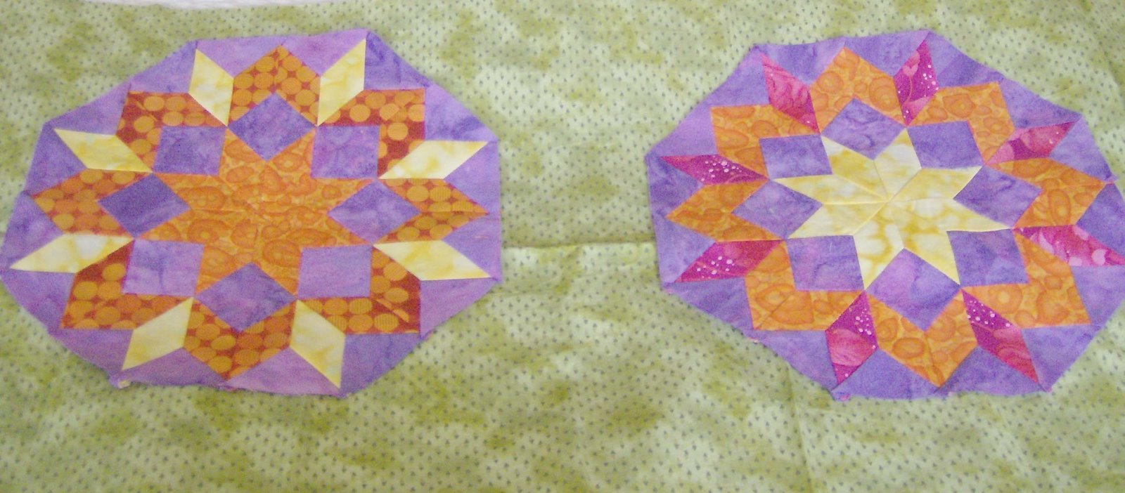
 This green isn’t bad. However, if I go with green I think it will have to be a lime green.
 A different blue than the one in the first picture, just a bit darker. Again the tropical punch by the water effect.
 Lester is spending more and more time on the windowsill now. Still no sightings of his entertainment troupe, the squirrels and birds, but the gardeners are providing some action out on the roof garden for him to watch.

And Smudge watching to make sure we don’t miss a photo opportunity.


Smudge is hilarious here, again! Total ham. As for the background, what about a dark orange that reads almost towards brown? I'm just tossin' that out there because if it were me I'd have black and I just like the stark contrast and that is OF NO ASSISTANCE to what you're creating so really, it's like flaming on your blog! :>
LikeLike
Hmmmm nothing really spoke to me, the only thing I thought of was Orange, though I was think a brighter orange since you want a “HOT” feeling LOL. Since your purple is suppose to be the neutral, orange will really make the insides of the blocks show off IMHO.I don’t think black would work, your purple may totally fade out (black is my usual first instinct).This will be really interesting to see what you end up doing.Crispy
LikeLike
If I was to choose one I would go with the green and orange. I think I would go with something totally different . Not sure what just yet
LikeLike
Of the choices you’ve shown, the darker mottled blue is my favorite, though I don’t think you’ve found the right background yet.What about a darker green, say a kelly green?
LikeLike
wow – i can’t believe how hard it is to find a background! i’m with the other commenters…i don’t think you’ve found it quite yet…oddly enuf, i like the one that you think washes out the purple…you need something really bright, don’t you think? you’ll figure it out and it will be fabulous!
LikeLike
In my opinion you have to stay away from the colors in the blocks because then they just mush and you lose the impact. Sky is blue in addition to the surise and sunset colors so why not try a periwinkle or slightly turquoise in addition to regular blue.
LikeLike
For what it is worth, I liked the “tropical punch by the water” version…
LikeLike
Hard choices, Cathi! I still like the gold background myself. But I have no doubt whatever you pick will look the best! :)By the way, I have an award for you on my blog.
LikeLike
Cathi the pink, that looks good, it will be interesting to see a lime green as well…..great photos of the boys..
LikeLike
lime green!! I love a quilt with lime green.Smudge and Lester are adorable as usuall 🙂
LikeLike
lime green!! I love a quilt with lime green.Smudge and Lester are adorable as usuall 🙂
LikeLike
Smudge and Lester are so fun to watch!I love the blue options!
LikeLike